Sunday, February 26, 2006

CAPTAIN AMERICA FINAL!


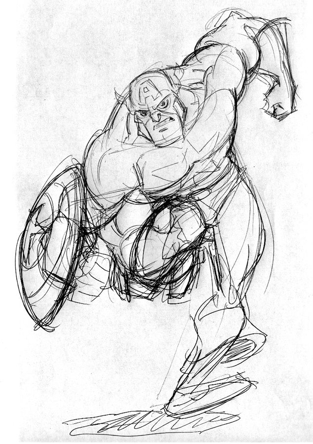
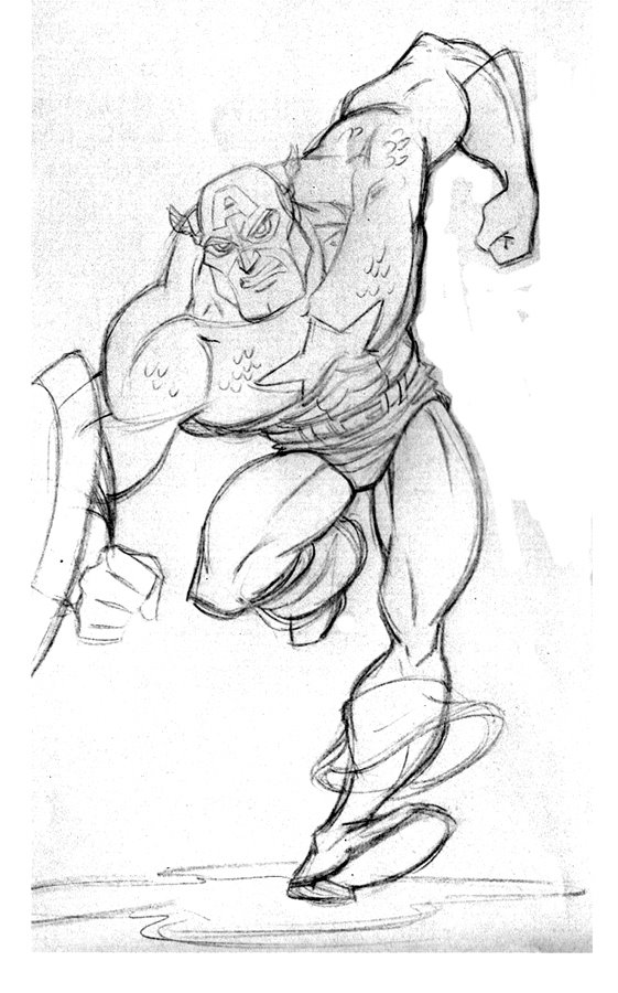
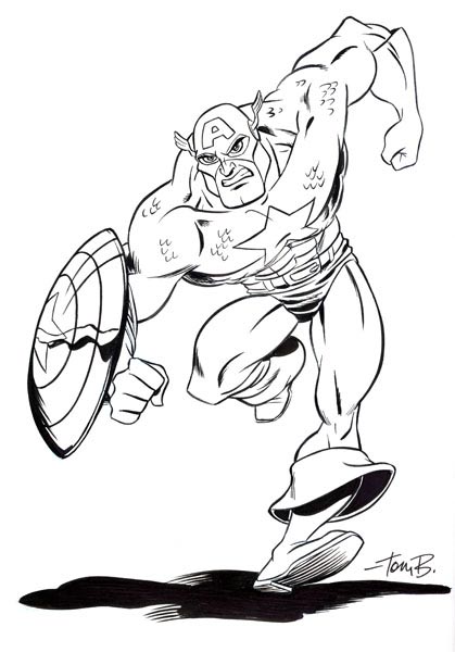
"Final" as in ran out of time and this will have to do. This is not what I wanted to do with this one, but it was due to Drawergeeks (www.drawergeeks.com) for Friday and I went out of town Thursday, so even less time. I really wanted to do some color on this. AND fix some stuff in the inks. DON"T even look at the shield....oh great, now you're looking aren't you....I told you. I did it all freehand with a Pitt brush marker and then ran out of time to even do the Photoshop fixes I wanted to. More disappointment. One day I'd love to do this "ultimate" Cap drawing I have in my head, I just don't know what it is yet. This one isn't it, but it's getting closer. I think this mythical "ultimate" version is more cartoony than this one too. Anyway, this one is at a point I can call it done and go onto something else. As my animation mentor, Mark Henn, used to say, "Make this scene as good as you can in the time you have and then move onto another one. Make the next one even better than this one and have more scenes in the movie rather than one perfect, short scene."

PS. On my biz trip to Indiana to speak at Huntington College, I met Dennis Jones, the great cartoony illustrator! He lives in that little town and came to my lecture. I had one of my character design books with me and he had a sketchbook with him. It didn't take me long to figure out a good trade (for me anyways, I hope he's happy too.). He happened to have a sketchbook page with his version of Superman and Captain America on it! I had to have it! Thanks Dennis! (www.dj-art.com)

Tuesday, February 21, 2006

Captain American PT. 1


The Drawergeek.com character this week is Captain America, which is one of my favorite characters so I had to do something! I don't have any time this week but I was in a meeting and did the rough "scribbles" version with a ball point pen. You will notice I had the arm with the shield originally going into the body. Bad silhouette, so I moved it off to the left and cleared the knee it was covering. The next drawing is a blue, tighter sketch of the scribble. It's a little light but the idea is that I want to color this by hand with markers and colored pencils probably. If I get the chance tonightish, I'll color it and post that. I leave town for a biz trip on Thurs. morning so I really don't have much time to finish this. If all goes wrong, hopefully, I'll at least ink the blue line version. Here's hoping....

Friday, February 17, 2006

Gun Fu!


This is only a semi-oldie. It was used as the cover for the "GUN FU" trade paperback. I did it awhile back and I think it came out last summer. GUN FU is a comic created by the talented Howard Shum and the interiors to the series were penciled by Joey Mason. Above you can see the pencils and the final color version. Howard did the inks and he used his colorist for the series, whom I can't remember her name. She's good though. Anyway, it was fun to do and I'm not sure I've shown both pieces together. Have a great weekend!

Tuesday, February 14, 2006

Sailors


This is a sketch I did of a bunch of sailors but with as much variety to them as possible. This was used as an illustration from my book "Creating Characters with Personality" (plug). It's based on an assignment that I got alot out of at Cal Arts. Mike Giamo was our character design teacher my freshmen year and I couldn't wait to go to his class every week! His was the assignment my brother and I would labor over, even sacrificing other class work. It's what we both loved- characters. Anyway, this assignment was to design a group of 5 to 6 characters that had as much variety as possible (and personality) but they all had to wear the same outfit or costume. The idea was that people were things differently depending upon their size, personality, or attitude even. Try it sometime, it's a fun exercise. I did this all on one sketch, no first sketches, then put it all together later kinda thing. What makes it fun doing it in a line up like this all on one sheet of paper is that you are constantly looking at the other characters and sizing noses to noses, heads to heads, etc. It forces you to put more variety into the shapes. The guy on the right is a version of Rob.

Friday, February 10, 2006

More Mam. City oldies


Just because there was such a HUGE response to the first posting of Mammoth City Messengers art, I thought I'd post another picture! Because you didn't demand it- the kids in the cafeteria hangin'! This was one of the 5 or 6 images we did of the kids in different "photoshoot" illos for marketing. Most ALL of these didn't get used at all. This is the pencils that ended up getting inked by the great Howard Shum. I can't find the final color for it right now. We had a Disney alum friend helping design the environments (like this cafeteria) by the name of Craig Grasso. Old school.

By the way, tell me if this has ever happened to you artists: Yesterday, a graphic designer who is in a office near us, came into our office for the first time. He looked around and saw all the art on the walls, the huge Disney art desks we have, and Rob sitting behind his drawing a picture. He was amazed! He said he didn't know that people still hand drew characters and stuff anymore. He couldn't believe we weren't just creating everything in Illustrator on the computer. And this is a Graphic designer! What are they teaching at art schools that people-even graphic designers- aren't learning about drawing anymore?!? I couldn't believe it.

Wednesday, February 08, 2006

Mammoth City Messengers


This is kinda an oldy, but alot of the work we are busy with now we can't post because of non-disclosure agreements. AND we don't have any free time. SO, time to dig through past stuff to post! This was one of many images Rob and I created for a Christian record company (the now defunct Forefront Records) for the "virtual group" Mammoth City Messengers. The idea was that the music producers had was to create fun, slightly techno music that had some relevant moral themes for preteen kids. They decided that they would (ala "Gorillaz") not have a "band" but have these cartoonish characters as the leads. They don't sing like in "Gorillaz" but the songs are kinda there thoughts and feelings. There was a story line throughout the album that tied into a comic book too. We illustrated the comics too. There were supposed to be three albums (and three comics that came out with them.) but they only produced the one album because of poor sells. Really, because of poor marketing that LEAD to poor sells. It was a good idea with good music behind it. We designed the characters, created "photoshoot" images like the one above, and illustrated one "half comic" that was something like 11 pages long and then a full issue #1 comic (22 pages!) that was NEVER RELEASED! Sigh. The most nostalgic part of this job is that it was the first job Rob and I got as Funnypages Productions. This started it all!

Friday, February 03, 2006

SOAR poster FINAL!


We just got the final images for that faux film poster we designed awhile back for the "film" SOAR. The posters were created to hang at AMC theatres around the U.S. to go along with at the animated trailer for the fake film SOAR that is part of their "Silence is Golden" campaign. The cool part (besides being able to hang this baby in the office some day soon) is that the directors had it painted two different ways. I guess they wanted the client to have a choice. The color version above is by the guy that does alot of the Disney posters, Corey Wolfe, and the other is by the incredible DREW STRUZAN!! He is the guy that has illustrated all of the best movie posters for films like: Star Wars, Indiana Jones, E.T. and TONS more! It's a huge honor for Rob and I. You can see the DREW version on Rob's Blog (hit the link to the right).

I reposted the original pencils so you can compare. Also, see my other post today that is below this one.

DUDE, MY BOOKS OUT!!!


A quick update: My "how to" book, "Creating Characters with Personality" is out!! I've gotten emails from folks who have already had theirs shipped to them from Amazon! A few extra nice people posted some cool comments on Amazon too. Check it out. If I could, I'd make a link right HERE, to get it at Amazon. Since I can't, just go there and search under the title.

The book has a great foreword by GLEN KEANE, as well as drawings by other designers like JACK DAVIS, J. SCOTT CAMPBELL, MARK HENN, PETER de'SEVE, BUTCH HARTMAN AND MORE! Also, a guest chapter on designing creatures by my buddy/partner, ROB CORLEY! Oh, and I did a few sketches here and there too. BUY IT, my kids are hungry!

Here's a quick drawing by Rob about how great it's gonna be doing book signings.....

Wednesday, February 01, 2006

Hana and TOMO


These are a couple images from a comic book property we co-created with a Disney alum friend Andrew Simmons called "Tomo". The one with all the body shots are different versions of Hana that I created as we were trying to design her. The other "expressions" models are more of the final (at the time) with some different expressions to "road test" the design. We are about to ink a deal with Zondervan (a Christian book publisher) to create a manga series of "Tomo". It's a whole new world for us, but pretty exciting also. Andrew is writing the series and Rob and I are going to Art direct/oversee it. Because of our busy schedules, we can't draw such a mammoth project (each issue is 150 pages!) but we think we are narrowing in on someone(s) that may be able to do it. It will be much more traditional Manga style than the above designs. These are just were it started.