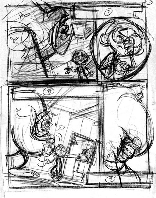

Last one for a bit on this project. I liked how the inks on this page came out. As with before, the first image is the (very) rough pass and then I used that as the basis for the final. I repenciled it in blue on the final board, then inked it. My process is based on drawing a page as few times as possible. I find it keeps me less bored with the progression of the work and it helps me actually get it done. :)
13 comments:
"Draw the page as few times as possible" sounds like a good plan, Tom. I see what you mean: I got stuck on the layout of page 7 of mine and it's been slowing down everything else. Oh well, guess I'll keep truckin' on it, eh?
The pages are looking good so far. I like seeing how rough your roughs are. It helps to see other folks staying loose early on.
~R
hah! these are great man! Love the kid design.
Cheers
Great work! Love what you've done with Opposite Forces! I have 2 of the issues. Maybe we can work together someday.
Stumbled across you r blog through drawer geeks. Phenominal works...wow :O bookmarked!
How do you decide how to lay out the panels on the page? Is there a pretty specific script you follow, or do you just feel it out? Do you do thumbnails before you start on the rough drawings? (Sorry for the billions of questions :)
I quite like how it turned out, beautiful inks
I really like the looseness of the roughs and how you layout the information. very appealing designs. Great Blog!
WOWZA! I'm learning a ton every time you post. These last posts are coaching me along as I'm doing my personal comic. I hope we can delve more into your thought about story structure and writing process sometime.
I think the last pose is very clear. It shows bigfoot's gots some luv handles!
I hope you keep posting despite these annoying visitors. Maybe they will find joy in something else.
Thanks all. I appreciate the nice comments and any comments for critique are always welcome- as long as they constructive. I shouldn't have to explain that any further.
As far as process, I mentioned in the blog that I try to keep things fresh and productive by not touching a drawing more than I have to. Also, because I come from an animation background- not comics- when I do comics, I like to keep the layouts loose just as if I were animating it. It goes faster too. I then take the rough layout, blow it up, and lightboard with a blue pencil onto the final board. Because the first stage is so loose, I'm not really tracing it but tieing it down further and making adjustments in poses and expressions as I go. So, even my blue line "tracing" is fairly loose in places. I like that because now I will ink it and I like discovering or improving things in that stage as much as possible also. I guess I can't stand any stage that is just straight tracing. Hope that helps.
Man this project is really turning out nice Tom and the inks on this page are just great man! Seeing you guys draw like this makes me ashamed that I do so much of my work digitally. It's that darn undo button man.... it gets me every time... That sketchy line around the boy holding his nose was the perfect touch too. Inspiring stuff as always man so keep those posts coming. Later tall tater!
Nice room!
I like the colour arrangements. It is beautifull in both it's obvious and subtle qualities!
Jordan Wan
great..just great..I look at chris sanders a lot too for inspiration..but Im getting inspired looking at your designs as well.
Post a Comment