Tuesday, March 28, 2006

More Mermaids!


These were a couple sketches I did as different concepts for the "Mermaid" image I did a bit ago for Drawergeeks. I just got back from a trip to NY over the weekend and I got the chance to "finalize" these sketches a bit. I ended up going a little "simpler" on the one I picked (seen in an earlier posting) with just one mermaid and a little less--uh--sultry. Also, the other one had more of a story to tell. These are just poses, which isn't as interesting to me. They were still fun to do and I thought I'd show some of the "warm ups" that went into the final one I chose. "Scribbles. Just scribbles" as a friend at Disney would always say.

Wednesday, March 22, 2006

Opp. Forces COLOR!


I wish I could say I pulled this out and this is mine, but I can't. Fact is the very talented and nice Adam Street took my inks from the last blog and offered to color them! It looks sweet. The depressing part is that MY color version of this image, which was going to be old school in markers and colored pencils, got ruined! I over did it and hate it and AAUGGHHH- didn't keep a hi-res scan of the inks! SO, I'll have to start over. My little quicky illo is turning into a longy! I don't have to time and can't use Adam's wonderful version because he only had my lo-res version to use. I don't know what's gonna be on the cover at this point. Sigh.

Friday, March 17, 2006

"Cartoonist!" cover design


I'm a member of the National Cartoonist Society and have been honored by being selected to be interviewed as a feature story for an upcoming issue of "The Cartoonist!", the newsletter mag for the NCS. For this they've requested a piece of art for the cover. Just a sketch or something. A lot of the questions were concerning my comic book "Opposite Forces" so I thought I'd make the cover feature them. (No copyright problems either). This is a little of the process. I did a really scribbly rough ( and a few others before this that I didn't want to scan), then refined it more on another sheet in blue (like giving Alexis a neck), and the last one here is a inked version. Now why I inked it is still a mystery to me because I don't want to Photoshop this, but render it more "by hand" with markers and colored pencils like the "Mermaid" piece a couple blogs ago. Problem is, I drew this on some real ratty photocopy paper that didn't even take the inks too good. Markers aren't probably going to work on this tissue paper. I will most likely resketch this on a better piece of paper and just render the thing a bit more sketchy (something else I originally wanted to do) with the markers and pencils. I MAY try to color the inked one to see how it looks also. It's ready to go anyway. Not everything on the inked version got better as you can see, maybe another good reason to do another. I'm just lazy, I don't want to.

Thursday, March 16, 2006

Sketches v3


Here's some more. This one has one of my first Captain America's too. I love this character, too bad he has been drawn and written so poorly for so long. He's kinda like Wonder Woman or Thor or Blondie. Everyone knows the characters, but noone reads the comics anymore. They need a good live action movie with tons of effects that al four of them can be in. That'll bring them the bling bling. I think I'm a little tired.

Tuesday, March 14, 2006

More sketches!


These are oldies but some of you all haven't seen them, I'm thinking. Just odd sketches in different styles that I like to draw in. I think they are different styles anyway.

Monday, March 13, 2006

Some Girl designs


This is an older design where we were trying to come up with a group of characters with different nationalities. This was supposed to be a Hispanic teen girl. When I do initial designs I tend to do a side view fairly early on. Part of that was something I started doing to just challenge myself since side views can be tough to make look good, but then it just became part of my process. If I can push a side view into something I like, it make me push the three quarter and front views also. I will go back into front views sometimes to match what I did on a side view. Is that backwards or what?

Wednesday, March 08, 2006

A LITTLE MERMAID


Not THE little mermaid, just one that could be related. This is a marker, inks, and colored pencils rendition of the Mermaid drawing I posted a monthish ago. I wanted to finish it up to trade with a friend. He gave me this incrediable pastel landscape painting and I feel like this is so unworthy but he requested it. I hope it goes over okay. I took the original rough sketch (in red) and inked over it then added the marker and pencil highlights. I'm not sure it works because the rough pencils still show through. There is this grey area between a good rough drawing and a tight, finished drawing. If you get too close to the middle it just looks bad. I'm still not sure where this one sits but it's done.

Monday, March 06, 2006

This Is America, Charlie Brown!


I just saw this artwork for the new DVD for "This is America, Charlie Brown". This is very nostalgic to me because this series was the first professional drawing job I had in animation waaaaay back in 1989ish. I was inbetween my first and second year at Calarts and I did what they call layout on two of these episodes. Here's the list:

1. The Mayflower Voyagers
2. The Birth of the Constitution
3. The Wright Brothers At Kitty Hawk
4. The NASA Space Station
5. The Building Of The Transcontinental Railroad
6. The Great Inventors
7. The Smithsonian and the Presidency
8. The Music and Heroes of America

I think I worked on the first one with the Mayflower (I remember drawing pilgrams and indians in the Schultz style) ,the 3rd one about the Wright Brothers, and the 4th one about the NASA Space Station. One of them, I think it was the Nasa one, they even gave me a credit at the end! My first one! It was really brief work, about a month or so, and then I had to quit to go back to CalArts. The little bit of trivia that goes with this is that this is the first series that has ADULTS shown in a Charlie Brown special. It's really weird seeing the Peanuts kids interacting with adults.

Friday, March 03, 2006

Tony Rabbit


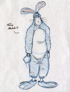
Okay, I never do this, but this is a copy of an actual email my brother recieved. The weirdest one I've ever seen! The details you need to know: Tony is my brother and is also an artist. He had drawn a picture of Lenny the rabbit (from his video series called "Lenny and Sid") for my mom to give to a friend. My mom's name is Cori and she likes to skate at a skating rink in California. This is a thank you letter from this man that Tony fowarded to me.

"START QUOTE"

Dear Tony Rabbit,


I hope you won't be offended by my addressing you as a rabbit, Tony. It is a habit I got into many years ago when I began calling the high school students I taught rabbits. They became John Rabbit, Barbara Bunny, Kim Rabbit. I also began calling all my friends rabbits as well. How sad, huh? Anyway, I loved your sketch of Lenny Rabbit on skates! He is so cute.and so beautifully drawn. I will treasure it! Thank you so much, Tony Rabbit.

As fate would have it, I ran into your mom, Cori Rabbit, several years ago at the ice rink. Not literally, of course. Your mom is one terrific lady rabbit, as you well know and she has a terrific sense of humor. She is so proud of you and your brother, Tom Rabbit, as she should be. Besides your mom's inner rabbitness, I noticed that she had this beautiful hair, almost the same color as mine; but hers is prettier.

Thanks again!


Woof, woof, woof...


Earl Rabbit

"END QUOTE"

Can you believe that this guy was a TEACHER??? Rob did a funny drawing after I told the story. I'll post it soon. Sad.

Thursday, March 02, 2006

Teen Titans!


These are two of a bunch of illos we produced for a Teen Titans book for Scholastic a year or more ago. Rob C. has a couple more he did from the same book on his blog (hit the link to the left) so check those out too. It's always fun and aggravating trying out a new style, but this one was mostly fun. I love cartoony comic book styles and this one is strong. Cyborg was not so fun, but the other guys were. This was one of our first tastes of drawing in a mangaish style also so that was a bit of a learning curve too. The book was/is called Robin's Case Files if it's still around and you want to find it. A good friend, Paul Conrad, colored all of these and he did an incredible job! Oh, and he digitally inked them too. All in Illustrator, which I think is what the client wanted. Tough stuff but he pulled it off like a pro! Thanks Paulie.

Wednesday, March 01, 2006

UNEARTHED! MAM City unleashed.


The two comic pages are from that oooold (actually only about 3 years ago, but it feels like forever) project that Rob and I did called Mammoth City Messengers. It was a CD, but had a comic series connected to it. These pages are two of 22 that were for a Issue #1 that was COMPLETELY produced but never saw print as the CD's didn't sell well enough to put out another album. This is older work so, as usual, not some of our favorite stuff, but at the time I liked it. I still like the characters we came up with. Howard Shum inked most of this with some help from a friend and coloring was by the great Rob Schwager. It was lettered too, but I didn't include that here. (Howard, this may be the first time you've seen these pages colored, huh? Sorry.) Rob S. really did a great job with the colors on these, even doing colored ink lines for the interior pages! You just don't see that on interior pages because of the work involved! Too bad. Anyway, this will do it for Mam City from me, I just dug these up and I thought SOMEONE should see them.